Visualizing Social Mobility
 Header to Mobilitown Infographic
Can We Make Mobility Measures Easier to Understand?
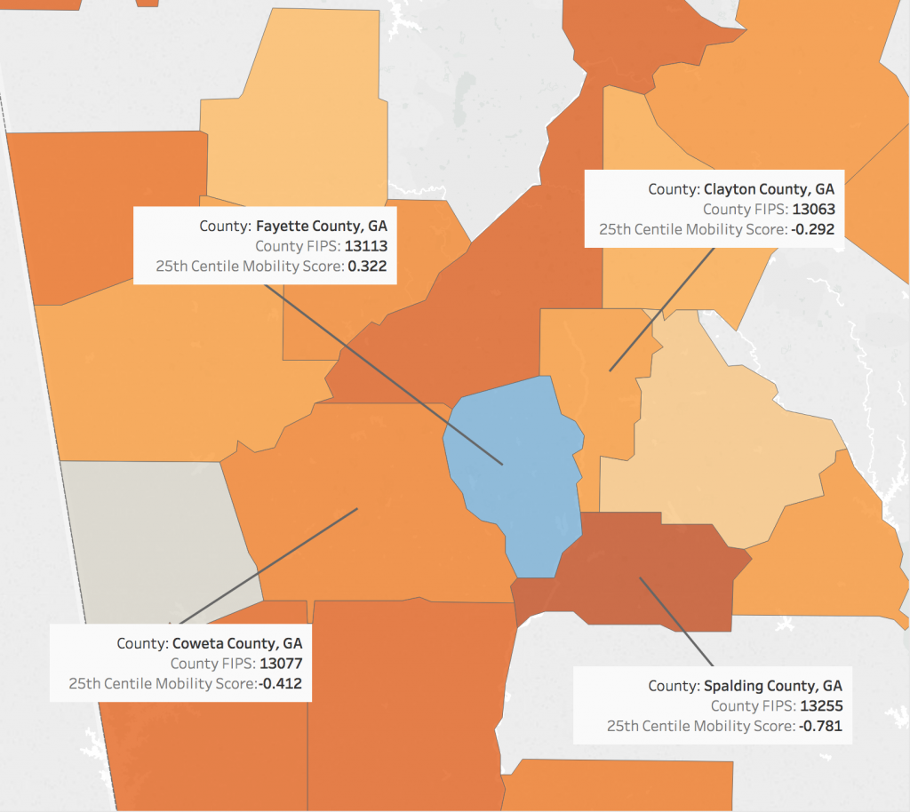
Some of my favorite visualizations of all time come from collaborations between Opportunity Insights/ Raj Chetty team and the New York Times Upshot. See for example, the 2017 classic: Where the top 1% and bottom 20% go to College
Yet if you have ever read an academic report about inequality or mobility you might notice that it is easy to lose track of what exactly all these numbers are supposed to mean. During the 2018-2019 academic year, I co-led an interdisciplinary team including experts in visualization, accessibility, inequality and poverty, contributing my own knowledge of social mobility.
Our team made two contributions to study the of mobility, visualization, and social science communication:
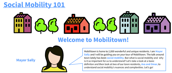
A collaborative website, Welcome to Mobilitown making the connection between academic concepts and public conversations about mobility and inequality. Click the link to follow Omar and Ava make measurement meaningful in this helpful infographic.
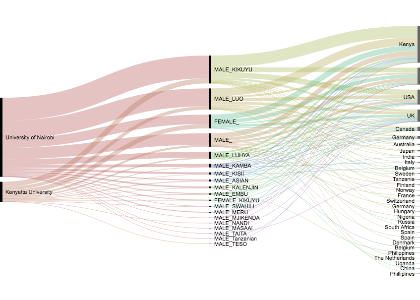
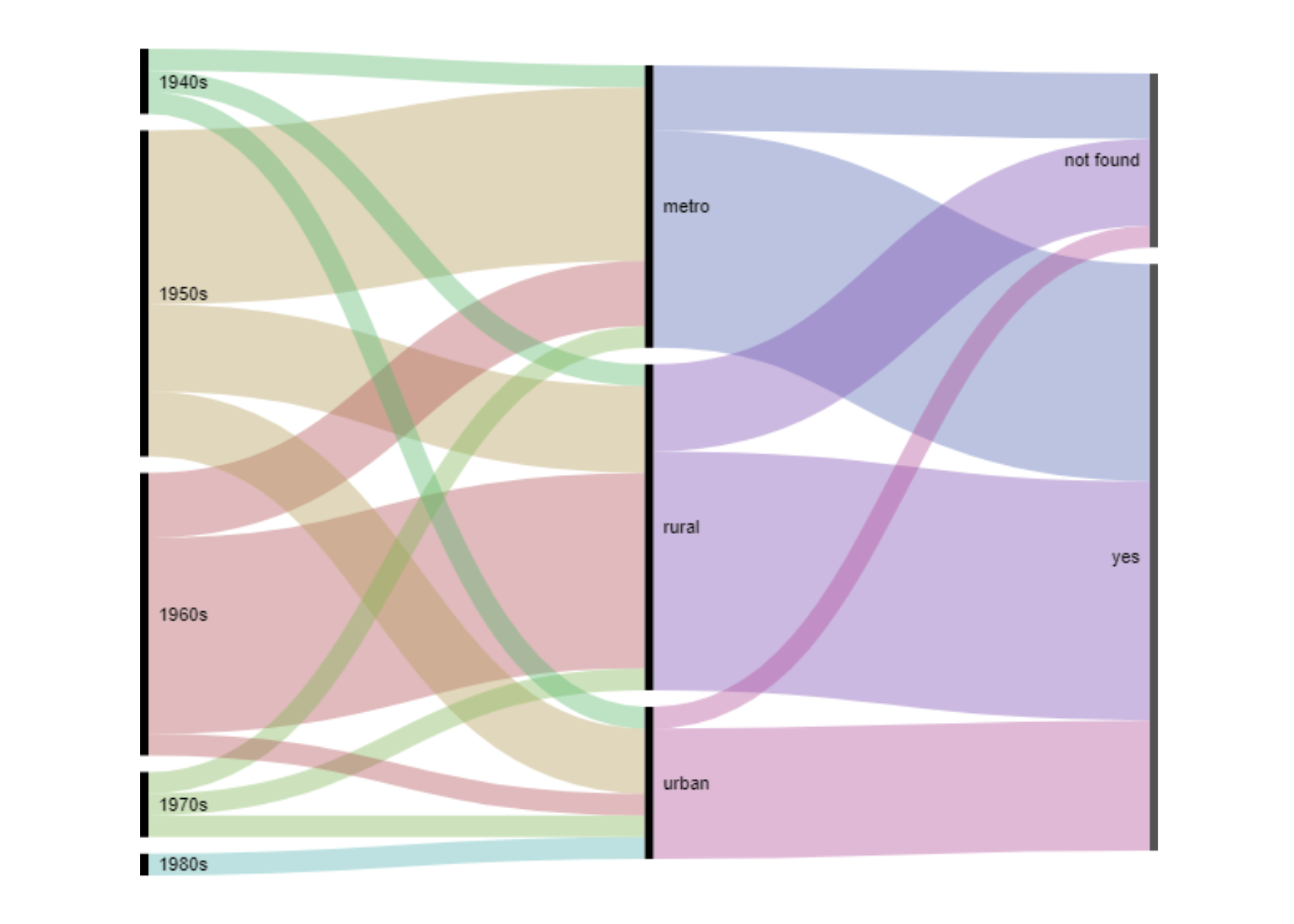
Six new primary research projects on social mobility by undergraduate team members.
See each paper’s leading visual, and clink the link to learn more.